CastingCouch
The Test Stage
During the design thinking test stage, we conducted usability testing and heuristic evaluation to gather feedback and insights on our project. This allowed us to identify potential usability issues and areas of improvement. We aimed to create a seamless user experience that met the needs and expectations of our target audience. Through various iterations and design solutions, we were able to refine our project and create a more user-friendly and intuitive interface. Here's a closer look at the design thinking test stage and the changes we made based on the feedback we received.
Individual Prototype Testing
We conducted user testing on the prototypes, with each member of the team working on their respective task independently. We asked several users to try out the interactive prototype and provide their feedback. This allowed us to gather diverse perspectives on the usability and user experience of our prototypes.
Before making changes based on the user feedback, we combined our prototypes into a cohesive one. The theme and overall design of the prototype were determined before implementing the changes suggested by the user feedback.
Please take a look at the slider carousel below to view some of the significant modifications we have implemented.
Issue
-
The performer's profile lacks certain information that can be useful for companies, such as height, weight, shoe size, and shirt size for modeling and acting photoshoots. Additionally, it is recommended to include both real and screen age information to provide a complete picture for casting decisions.
Refinement
-
We added optional information text boxes for height, weight, and other relevant details to the performer's profile page. We also included dropdown menus for optional information such as shoe size, shirt size, and screen age, making it easier for performers to input this useful information that can help companies make casting decisions.
Before

After


Heuristic Evaluation
After we combined our prototype and made the refinements, we conducted heuristic evaluation based on Jakob Nielsen's standards. This evaluation was carried out by our team before the usability testing phase, as it helped us identify potential usability issues that may have been overlooked during the development process. Moreover, the evaluation allowed us to ensure that our interface adheres to established usability standards and enabled us to fix any issues before presenting it to third-party users in the usability testing phase.
Please take a look at the slider carousel below to view some modifications we have implemented.
User Control and Freedom
Issue (3 - Major)
Users have limited control over the input overlays, as they are unable to close them. While this is not a major issue for required fields, it can be frustrating for optional fields such as gender and age range, where users are forced to provide input even if they do not wish to. This can limit users' freedom and control, leading to a less positive user experience.
Refinement
We added a back button to all overlays. This gives users more control and allows them to easily navigate away from optional fields they do not wish to fill in. This update enhances the user experience by providing more flexibility and freedom to the users.
Before
.png)
.png)
After
.png)
.png)
Usability Testing
In order to assess the effectiveness of our interface and gather user feedback, we conducted a usability test with four individuals representative of our target demographic. We created task scenarios that corresponded with our primary user tasks and measured various metrics, such as the time taken to complete each task, the rate of successful task completion, and the frequency of errors encountered. This allowed us to evaluate the efficiency, effectiveness, and learnability of our interface. Additionally, we solicited feedback and suggestions from the test users to refine the overall user experience, ensuring that our interface meets the needs and expectations of our target audience.
Please take a look at the slider carousel below to view some of the significant modifications we have implemented.
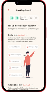
Issue
Users may experience uncertainty when inputting shirt and pant sizes due to the variations in sizing systems across different brands, resulting in confusion about what size to choose. For example, an "S" size could vary across brands.
Refinement
In response to this issue, we have updated the body measurement fields to be more production-friendly. Specifically, we have changed the fields to "Shoulder Width," "Chest," and "Waist," which are more universally understood. Additionally, users can leave these fields blank if they do not know their measurements, reducing the potential for confusion.
Before
.png)
After
.png)